- Olga van Dijk
- View Portfolio
- Image 221 of 270
- Added 13 Jul 2007
- 773 Views
- 91 Comments
- 1 Favorite
- Share This Image On...
***This collage/painting is juried into the show of
the CCAA's Art Gallery exhibit "Color: Bold/Subtle"
running from Sept.8th - Oct.5th 2007 ***
__________________________________
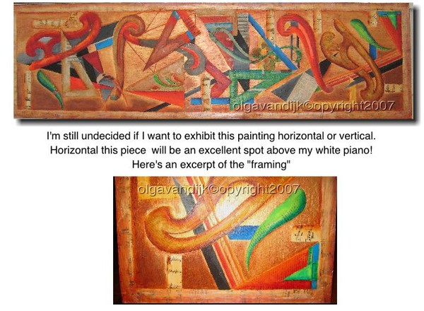
CORRELATION©
"a relationship in which two or more things are mutual complementary, or is caused by another."
After a little break I'm working hard to get some more new pieces finished for my (first) solo show @the University of Delaware's Library in Wilmington in September.
________________________
Some INFO about this Collage/Painting:
Good exterior grade plywood or birch plywood provides an excellent painting support.
I choose for the very smooth surface quality plywood because of its resistance to cracking, shrinkage, twisting/warping, and its general high degree of strength. Furthermore I could decide on the exact size.
I love to work on wood to get the desired visual effect of the grain of the material.
It is a lot of work to prepare though, to avoid warping, etc.
I sealed the front and back with a premium wall primer and sealer. I didn't sand it to keep the grain.
Then I reinforced a backing frame glued to the primed back.
I used newspaper for all the geometric shapes. Some of the pieces I didn't paint and to keep its color.
The glue (Liquitex matt) is archival and will not yellow. I also mix it in with the acrylics.
I love the copper earth tones I used and raw sienna for the background, which gives CORRELATION a warm color effect.
Framing: I glued vintage sheet music as a frame at the sides. Then I used modeling paste over the paper, sanded it, which gives it the marble-like look. I finished it with a burnt orange and raw sienna and sealed it with pearl Liquitex, which makes the color soft and warm.
This piece is signed & dated verso
so the new owner can decide to hang this piece horizontal or vertical.
mixed media Collage/painting on plywood
Dimensions:48' x 13.5' (122 cm x 35 cm)
Copyright Olga van Dijk 2007©
Unauthorized copying or use of images is prohibited.
5 of 91 Comments Show All 91 Comments
Timothy McAninch 02 Jul 2008
Horizontal is more peaceful and reads as a musical landscape. Vertical gives more movement, but also a feeling of falling.Sara Deutsch 02 Jul 2008
Innovative and striking design!Betty Fletcher 13 Feb 2008
Very pretty and colorful! BettyRobin Brown 18 Nov 2007
Gorgeous Olga, its giving me a feeling of Aztec art but I might be confusing that with some other culture. The bottom line is I really like what I am looking at & the info is very useful too. XXAmanda Tucker 27 Jul 2007
this is a wonderful piece and would look wonderful in most peoples homes, I like it better horizontal!