- rebecca hanson
- View Portfolio
- Image 21 of 53
- Added 16 Apr 2006
- 163 Views
- 14 Comments
- Share This Image On...
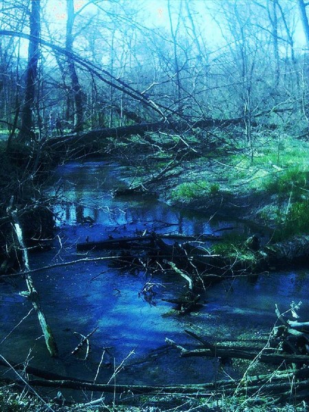
these 4 photos are part of a set, kinda. well, i think they just look better as a group because they each capture different color schemes and moods. i'll have to post the other two next month since this is my upload limit. i took these on some nature walks lately, trying to get a good one to draw (maybe). but all of them have tons of trees and stuff, so i'm not sure if i can quite handle that yet. i apologize for the crap quality, my digital camera is kinda old. all the pictures were really grey and dingy, so i had to up the colors with my crappy image program. and save them in jpg form a couple times, which lowered the quality even more. i might end up scrapping these, but i just wanted some input first. this was taken in a park in ames, ia. i could've taken pictures there all day but eric was in a hurry because he had to work and was getting bitten up. all the colors were so crazy that day, but my photo couldn't do any of it justice. it was strange how i'd take a picture of a scene and it'd look all bluish, and i'd do another one of the same scene and it'd be all reddish. i'd really appreciate any feedback, thanks for looking!
5 of 14 Comments Show All 14 Comments
Olivia Andersson 03 May 2006
this one is really coolstephanie atlee 19 Apr 2006
very mooding and enchanting placeTerry Bullard 17 Apr 2006
very niceElizabeth Stringer 17 Apr 2006
I love the colours and the feel of this oneCathie Brock 16 Apr 2006
This is such a great photo that it is hard for me to say, but would have a green tint not red...Cath xxx