- Kate Malcolm
- View Portfolio
- Image 14 of 68
- Added 06 Feb 2006
- 415 Views
- 1 Comment
- Share This Image On...
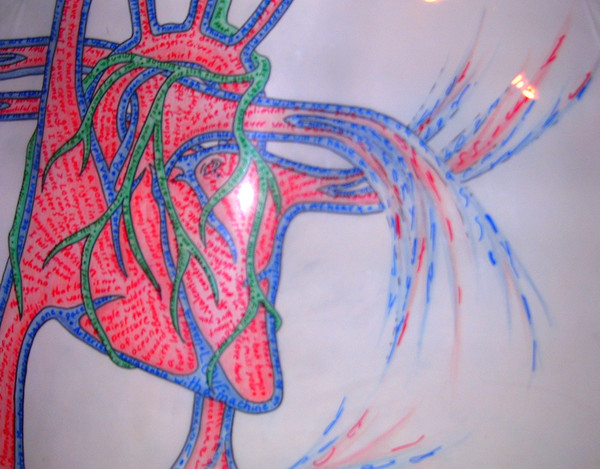
First and foremost I would like to apologise for the bad quality of the photo taken of this image. It sucks! Now, this image may seem very simple at first but there is a valid reasoning behind the way it looks. First off, it is composed of four seperate layers. The base is bristleboard with a black marker outline and pencilcrayon used to colour the seperate layers. The other three layers are all done on a clear transparent material (that was actually a desktop protector when I bought it ^_^). These three layers each have text in a seperate colour representing a seperate concept upon them. These three concepts are the heart (obviously), friendship and love. What I did was I asked friends, family, aquaintences etc to send me wrods, phrases, sentances and so forth of what came to mind when they thought of the heart, friendship and love. The blue text represents the 'heart' text. This is the structured outline of the organ. What holds everythign in place and acts as the container: "Everyone has one", "Compassion", "Tricuspid valves", "I wear my heart on my sleeve", "You are heartless", "Cardiovascular" etc. The second layer, the green, represents friendship. This section is depeicted as the veins of the heart. The sectons that feed the heart and supply it with new substanence: "Reliable", "Makes life more livable", "I'll make you cosmooooos", "Call me at nine", "Fondness", "Someone too fuck up with you", "Someone to hold your hair back" etc. Finally si the red section which, yes, does represent love. This is the central reason for the heart. It is was allows us to function and indeed, live: "Passion", "Can hurt as much as it can be admired", "I love you but I'm not IN love with you", "You stay in bed and I'll get breakfast", "A lingering perfume haze", "Adore", "I miss you" etc. Althought his piece may not be one of my most visually stimulating ones, nor even one of my most appealing images I think it still stands as one of my favorites simply because the thought process behind this si so deep and the emotion linked with it so strong. I can only hope that you are able to also appreciate this piece despite the bad picture which, unfortunetly, does not allow for the text to be read (which is why I included a small example of what I used and what I was supplied. Thanks for being so patient with me. I hope it was worth your time.
1 Comment
nathan swenson 08 Feb 2006
this is peculiar that is why i like it