- Anastasya Krasnova
- View Portfolio
- Image 45 of 65
- Added 20 Jun 2004
- 272 Views
- 6 Comments
- Share This Image On...
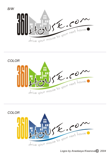
It is one of several variants logo 360House.com which I have presented on competition. Please do not overlook to leave your comment to this. Thanks.
5 of 6 Comments Show All 6 Comments
Greg Joens 18 Jan 2006
I like yours better than their current logoJustin Tucker 22 Jun 2004
very nice! great design, flow and variety of text makes it very interesting but not too busy. Looks great with or without color, very proffessional workSarah-Lynn Brown 20 Jun 2004
I also an partial to the blue & yellow version I think that color scheme is much stronger than the other two. Excellent workArmando Salas 20 Jun 2004
Precious!thea walstra 20 Jun 2004
I love this desigd.