- Tamara Beloved
- View Portfolio
- Image 33 of 41
- Added 13 Nov 2003
- 136 Views
- 7 Comments
- Share This Image On...

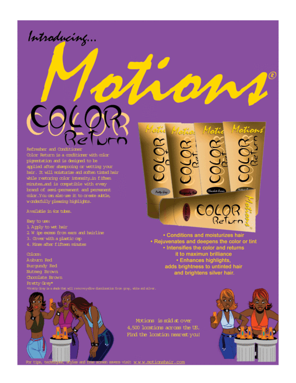
this is an ad for a hair care product to go with my EbonyTeen magazine cover. It may look a little rough cause of the file type i had to save it as to upload it. I made the bottles and layout in Photoshop and I made the rest in Quark
7 Comments
Tamara Paylor 16 Jan 2004
as far as the lighting i did goof on that but when i went to rotate it the design of the tubing got messed up because i had accidentally flattened the layers with all the elements to the tubingTamara Paylor 16 Jan 2004
actually as i stated before this one design in particular lost the font that i actually used when it went from mac to pc...this is not how it was donePamela Davidson 16 Jan 2004
the overall design layout is good, But I have noticed in many of your pieces that you use way to many font types on one page. If the yellow font on the left was the same as on the right, you could read it. I would also put some kind of shadowing under the product tubes so they look grounded, again you need shadows on the products themselves, the one on the right looks flat and pasted, the lighting does not match up, you have it coming from all directions, I looked at the website of this product, check the packaging of this product, light is coming from the top on all tubes.Tamara Paylor 16 Jan 2004
lol...believe it or not those are the characters they use on the products website...lolAmy Pye 16 Jan 2004
The yellow text on the purple is a little hard to read, but I really like the girls on the bottom. However, they look a bit like they're confused by the product.Alice Duke 10 Dec 2003
I like the purple/yellow contrast, but people often find pale text on a dark background hard to read. I love the girls at the bottom though!Shamara Lobo 14 Nov 2003
I give it a 10 cause the ghetto chicks are funny.