- Tamara Beloved
- View Portfolio
- Image 34 of 41
- Added 06 Nov 2003
- 1505 Views
- 13 Comments
- Share This Image On...
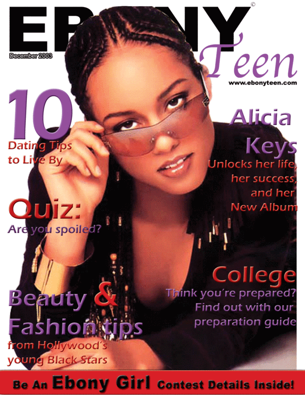
this is a class assignment i just did...if you are familiar with Ebony magazine then you should see that I followed their style. This magazine doesnt exist though.
13 Comments
Maddison Jamison 28 Apr 2006
It may not exist but it's a great front-cover and I would believe it was real if you hadn't said it's not. Very professional-looking!Tamara Paylor 16 Jan 2004
i only used 2 fonts...just different effects on the same font...thanksAmy Pye 16 Jan 2004
I think this does look professional but I also think that the bevel could have been avoided and less fonts could have been used. I can understand the title being a bit covered, big mags like Cosmo do that quite often. Nice layoutTamara Paylor 22 Dec 2003
thanks for the comments...and as far as grades my teachers who all work in the industry all have given my A's on my work...i maintain a 4.0 GPA...thanks :)Melissa Rinaldi 22 Dec 2003
Still think if fonts were less..like I said, and I did look at EBONY cover, heres a link. The cover is well dony, likes like basically 90% of covers, simple serif fonts, caps used in title, and in others. Still diff from yours. But like your a little hidden :)Javet Kimble 22 Dec 2003
I do read Ebony and I am a member of the Black community and I love what you did here and agree that others should check out your source material and then judge. They may possibly still not get it though! What grade did your instructor give you?Tamara Paylor 22 Dec 2003
this magazine cover was keeping in step with what EBONY does with theirs...this is not to be compared to any other magazine but EBONY...pick that up and see how close i got to their design....except for the title i used the same font the entire coverMelissa Rinaldi 20 Dec 2003
sorry...looks like affter bevel, effect.. i was calling your piece yuk..can't see all I wrote..your piece isn't yuk...just need workMelissa Rinaldi 20 Dec 2003
again type, too many...like photo, look at a mag cover, pick one any one, this should be a starting point. Fonts, type, tracking (yuk) Kern (yuk) (feelin' like I'm in Quark) are so important...as well as effects...unless we are in 1989...effects...beveling should be used with XTREME (YUK) caution. I am a specializer in type, most of my clients like type opposed to alotta of images. You are on the rite track.Sea Artist- Leigh Karchner 20 Dec 2003
I think it looks great. The 3 was NOT deserved. Looks professional to me!Shamara Lobo 10 Nov 2003
What Magazine is it ?.... EPONY...? This really Sux ... lollipops. ... Sweet!.Tamara Paylor 07 Nov 2003
being a popular magazine (perhaps only within the Black community) the name doesnt have to be fully shown and in fact it actually is hardly shown...but thanks for the comment :)MICHAEL LUKAS 07 Nov 2003
ok ,wish i can see cover name more?