Login
Browse
Browse / Search
Daily Uploads
Artist Portfolios
Holiday Gallery - NEW!
Featured Artists
Random Artwork
Shop
Shop Art
Creative Minds Book
Art Books
Photography Books
Coloring Books
Services
Basic Membership
Premium Membership
Personal Website
Comparison Chart
Art Book Publishing - NEW
Community
Announcements / Blog
Art Duel
Art Contests
Member Discussions
Idea Board
Artist Groups
Top Active Members
Login
View Shopping Cart
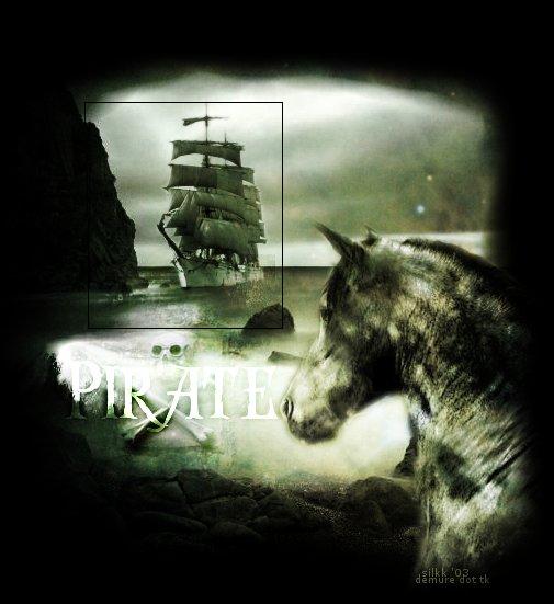
pirate 2
by
Kasha Moray
Home /
Artists /
Kasha Moray /
Image Detail
Previous
Kasha Moray
View Portfolio
Image 17 of 20
Added 24 Oct 2003
121 Views
3 Comments
Share This Image On...
Previous
17 of 20
Next
View Artist Portfolio
Next
Tags
Art/Drawing Misc.
3 Comments
Anonymous Guest
Post Comment
alexandrea meadows
24 Oct 2003
ooo, nice contrasting darkness around the focal point. I wish the "pirate" lettering stood out a little more, but a great concept nonetheless. the low saturated colors go very well with the amount of darkness.
Bluemoonshadow
24 Oct 2003
nice
cile bailey
24 Oct 2003
great. Cile
3 Comments
alexandrea meadows 24 Oct 2003
ooo, nice contrasting darkness around the focal point. I wish the "pirate" lettering stood out a little more, but a great concept nonetheless. the low saturated colors go very well with the amount of darkness.Bluemoonshadow 24 Oct 2003
nicecile bailey 24 Oct 2003
great. Cile