- rebecca hanson
- View Portfolio
- Image 29 of 53
- Added 16 Sep 2005
- 257 Views
- 6 Comments
- Share This Image On...
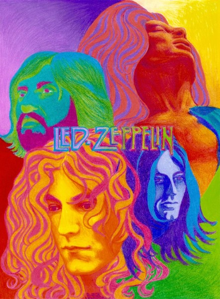
this is a poster like design i've been working on for a month or so. i didn't realize bristol was a bad surface for CP, since it's a new medium to me, until i was too far along. so i had a hard time building up layers and making it look smooth. the scanner changed the pinks and purples and blues a lot. but i think the faces turned out okay. thanks for looking!!
5 of 6 Comments Show All 6 Comments
George Wallis 21 Jan 2007
wonderfully composed and colored tribute to an incredible group, very cool styleAnonymous Guest 01 Nov 2005
Wow. Thats brilliant!!!!!!!!!Chris Hoffman 18 Oct 2005
Very nice,so rare to see Zeppelin art....you really have Plant down....great...where's my Physical graffitti cd....stephanie atlee 18 Sep 2005
wonderful colors and textures...nice work on this....it is always a learning experience.Sarina Renee 17 Sep 2005
That's very good. That must have taken ages to do. I like the one on the bottom left, and the top right; their shadows and highlights seemed to have blended better. It's incredible!