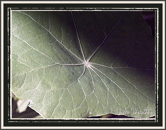
i think a tighter crop at the bottom left would be better... my eye is just drawn there instead of focusing on the contrast... great detail though- nice work
Artist Reply: Thank you! I really appreciate your view. I did take a look at a tighter crop, but felt that the bright spot in the lower left created a sense on tension, as the eye wants to be drawn to both the light and the darkness. Both sides pulling at the eye equally, perhaps, as evil and goodness pull upon the human spirit? I tend to "read into" things symbolically, though. In the end, it all comes down to personal choice I suppose.
5 of 7 Comments Show All 7 Comments
Miro Gabriele 04 Jun 2009
very goodtom dailey 02 Apr 2006
It does have a unearthly quality to itAnonymous Guest 26 May 2005
I know this is weird but this is my favorite...Looks spacy...oddyssey..you see???Stephanie Sonju 24 May 2005
i think a tighter crop at the bottom left would be better... my eye is just drawn there instead of focusing on the contrast... great detail though- nice workthea walstra 23 May 2005
Gorgeous work Tree