Login
Browse
Browse / Search
Daily Uploads
Artist Portfolios
Featured Artists
Random Artwork
Shop
Shop Art
Creative Minds Book
Art Books
Photography Books
Coloring Books
Services
Basic Membership
Premium Membership
Personal Website
Comparison Chart
Art Book Publishing - NEW
Community
Announcements / Blog
Art Duel
Art Contests
Member Discussions
Idea Board
Artist Groups
Top Active Members
Login
View Shopping Cart
Member Discussions
Home /
Community /
Member Discussions /
Post
21
September, 2016
gerard bahon
419 Views
8 Comments
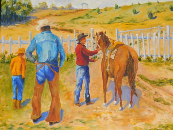
New oil painting .Critics please .I need input for this painting ..
Reply
8 Comments
MICHAEL KENNEDY
20 Nov 2016
Good impression and colours The shadow under the horse is very defined maybe a good Idea would be to have the ground under the horse a bit more rugged and the shadow at different levels over say stones or a pudle. A difficult subject to choose.
Yury Yanin
21 Nov 2016
The whole composition looks as a bit over weighted to the left – all human figures and distant trees are on the left half of the picture. Shadows of distant trees and all other closer shadows seem to point in different directions and have different length (thus showing different time of the day). As it is more likably mid day, I think that shadows should be darker and not so bluish; I suppose also that the whole picture should be brighter and more contrast under a Southern sun. And brims of hats could be wider to my test… And the most important: I love your art, so you may ignore all above because you know better.
Crazycatz9
13 Feb 2017
I'm assuming this is acrylic? the last comment I do agree to add not only the shadows are pointing off the clock but the direction of the light and brightness of the characters don't match the shadows. i'll try to explain this as much as I can if you have a ball and shine a light on it thus casting a shadow but the ball will reflect the source of the light showing gradation from bright to dark, thus matching the direction of the shadows cast.
Al Budarin
07 May 2017
Nothing to critique,as its a wonderfull Work of art
Ginger Olansen
22 May 2017
Great picture and not an easy one to do. I also suggest to fade some of the colors in the background the father away, from trees to the grass and hill. Yes, I agree the shadows are too blue, shadows need to be grayed-out or not so blue. Keep up the great work
Dina Be
24 May 2017
The shadows appear too long for this time of the day.
Joanie Holliday
28 Jun 2017
Looks terrific. Only the shadows are too blunt. I'd use a gray and make them very soft and flowing. Hope this helps. Great scene.
Linda Hammar-Del Favero
24 Sep 2017
I like the colors and landscape in general, but would eliminate the two figures to the left and also eliminate the shadows. They are distracting. They aren't necessary. The focus should be on just the man and his horse. Take a look at horses legs, too. They are too skinny going toward the hooves. More sky would be more balanced, too. Good job overall.
Reply
Back to Category
Reply
Member Artwork
IMG 1371
by
John H. R. Pieper
Guitarist
by
Akeem Agbelekale