- Rhodgier Chua
- View Portfolio
- Image 27 of 31
- Added 09 Mar 2004
- 335 Views
- 2 Comments
- Share This Image On...
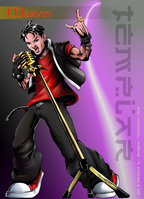
This piece is a caricature for a promotional poster of a recording studio it's called "HELICON STUDIOS". It is a pencilled artwork and the colors was done in Corel, so how well is please tell me guys...?
2 Comments
Tim Matthews 13 Mar 2004
Ian made some good points. With the neon in the background you have an oppurtunity for dynamic lighting. Actually, there could be three light sources. The weakest light source would be on the left to separate him from the shadow, the next light source would be on the right from the neon. The neon will leave a hue of color on the character, i am not familar with corel so i could tell you how to do that. The final light source is from the front, which you have. From a drawing standpoint, the pic looks great!! nice jobIan Areola 13 Mar 2004
Well in this piece you quite improve from the other pieces that you made, any way i suggest that you should be keen and be aware of where to put your shadows and lighting, so that it will bring life to your drawing. First focus on a particular light source for your highlights, so that you may know where to place your shadows, then focus on a secondary light source for your softlights, this will give more emphasis to your characters. Try checking out other artstyles from anime to realistic, try to establish a mindset or an understanding about these styles, of how these works are so good. I suggest you practice, practice and I know that you will improve.