- erika brodie
- View Portfolio
- Image 323 of 471
- Added 02 Jul 2006
- 386 Views
- 4 Comments
- Share This Image On...
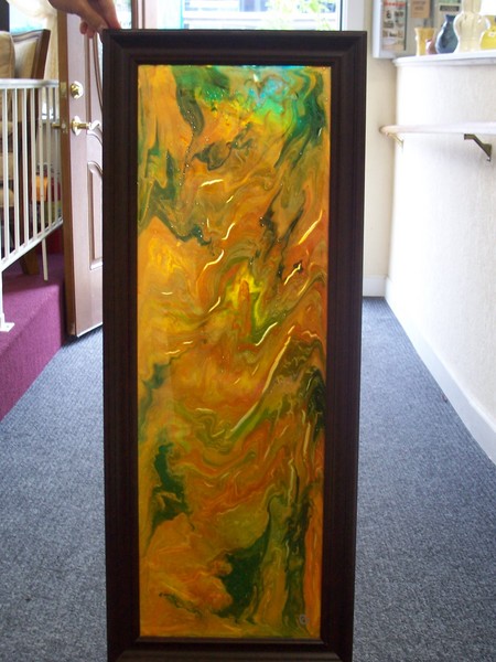
I always try to use flow and direction in my abstracts to give the feel and then colors are an obvious representation of the symbolism between objects or what I am trying to get accross....I thought the texture was great...it's hard to reveal that with the sun beaming through the door and the reflection so I am just downloading this from the show this weekend. At the Monroe St. Gallery
4 Comments