- Christopher Kelleher
- View Portfolio
- Image 2 of 13
- Added 16 Mar 2004
- 591 Views
- 2 Comments
- 1 Favorite
- Share This Image On...
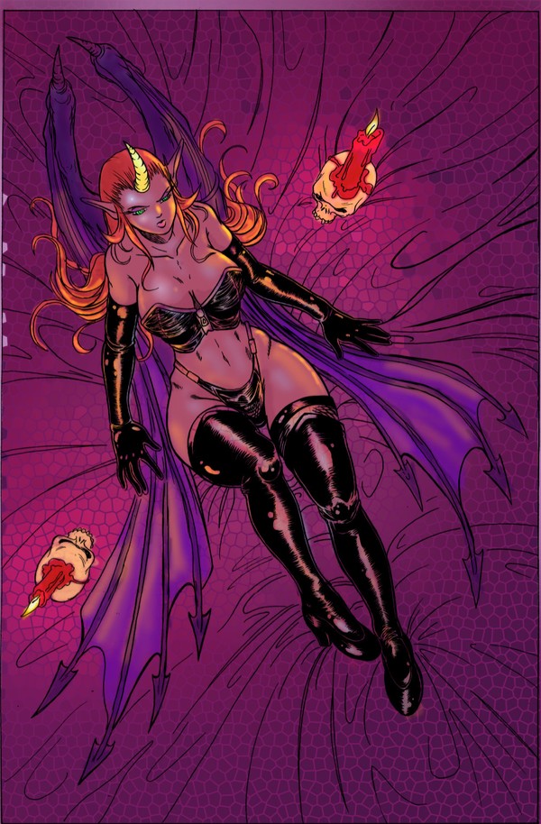
just trying out some color stuff. i think i need to amp up the contrast between the darks and highlights. tell me what you think.
2 Comments
Avery Easter 18 Dec 2004
Very nice ink work from the pencils and the color choices are strong too. as far as highlighghts and darks go you could create some shadows beneath her and around her. the highlights are fine to me but you could sharpen the r intensify the one's you've given her.Brian Brubaker 16 Mar 2004
Very Nice. I am impressed with the color and Shading.