-To paraphrase an oft used phrase, "This painting is way cool and totally rad!!!!!" The use and placement of contrasting colors and the deployment of secondary and tertiary compliments to modulate the transitions between the contrasting colors is absolutely outstanding. I'm sorry if this comment is little too ethereal, but I am adopting musical terminology to a visual composition.
29 Comments
Aleksandr Klyuyanov 22 Apr 2015
Very nice composition and combination of colors! Like it!Caballero Salguero 17 Nov 2009
Good colors and very nice Composition. Sharon. Great Acrylic. Beautiful. JoséMary Vargas 02 Oct 2009
Great detail!Karen Johnson 08 Jul 2009
Wow! how did you do this Sharon?Allison Rainford 10 Nov 2008
Love this so much going on and loads of different colours in one space, but all fitting in !andrew green 18 Oct 2008
this looks really cool ,cindy sink 19 Sep 2008
Nice sharon I like this one alotSusan Chasteen 11 Sep 2008
nice abstract!Jane Pecic Dial 03 Sep 2008
Great color and design.mimulux 24 Aug 2008
love this technique!gianantonio zago marino 26 Jul 2008
mi piacelillianhibiscus 07 Jul 2008
Magnificent work Sharon! Incredible colors. Just fantastic.dawn lochridge 04 Jul 2008
that is cool. something very different and eye catchingAnonymous Guest 03 Jul 2008
I really like this one Sharon.Gerrie Olly 23 Jun 2008
Beautiful Sharon, you are one very talented lady. Love all your designs & art work! xoxoindarto budi 06 Jun 2008
very creative....great coloring n detailspamela jones 28 May 2008
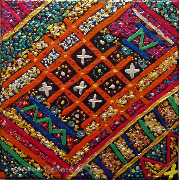
This is lovely Sharon, very effective with the pearlized metalic acrylic paint. It reminds me of lots of little coloured beadsJo Ripley 21 May 2008
this is exciting very good work Jo Shepherd RipleyJohnnie Belinda Ramey 18 May 2008
this is great.annette steens 30 Apr 2008
lovely work!Fernando Garcia 24 Apr 2008
Very colorful, I really like the texture.Mimoza Oronova 21 Apr 2008
Lovely colors and style !Joanna Jungjohann 20 Apr 2008
super tight!Emily Reed 20 Apr 2008
Wow, how unique and awesome!Stanton Manolakas 20 Apr 2008
-To paraphrase an oft used phrase, "This painting is way cool and totally rad!!!!!" The use and placement of contrasting colors and the deployment of secondary and tertiary compliments to modulate the transitions between the contrasting colors is absolutely outstanding. I'm sorry if this comment is little too ethereal, but I am adopting musical terminology to a visual composition.Julie Mayser 20 Apr 2008
Really "neat"! and very different from your usual....jamie winter 20 Apr 2008
fantastic colors and forms this is realy coolCat Johnson 20 Apr 2008
lovelyRobin Mead 20 Apr 2008
Very gorgeous and textured!!Lovely and colorful!!