- Chris Patton
- View Portfolio
- Image 22 of 27
- Added 15 Feb 2007
- 438 Views
- 7 Comments
- Share This Image On...
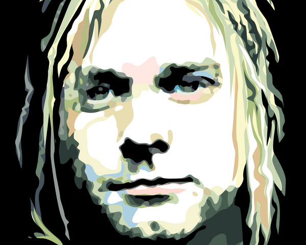
Father of grunge done in a vector style. A really nice piece, I'm very proud of this.
5 of 7 Comments Show All 7 Comments
Mark Peterson 01 Oct 2007
Excellent use of your available tools! Fantastic!camilo villalvilla 01 Oct 2007
chris I love covain music and yuor portrait looks excellent. this pop style in it, remenber me some serygraphical works in the 70 cuban graphic designAnonymous Guest 01 Oct 2007
chris I love covain music and yuor portrait looks excellent. this pop style in it, remenber me some serygraphical works in the 70 cuban graphic designLori Wadsworth 22 Feb 2007
nice job!Jerry 15 Feb 2007
Great style, impression and colors!