• Rose Buchholz
  • View Portfolio
  •  
  • Image 35 of 41
  • Added 16 Nov 2005
  • 203 Views
  • 7 Comments
  •  
  • Share This Image On...
Wistful2

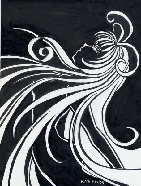
I can not remember what you call it, but I redid Wistful, but opposite colors...what's the technique called? Anyhow, this one was so much harder! I still like the first one better. Materials: india ink, acrylic paint in white, and mircon pen.

7 Comments

You must be a logged on member of ArtWanted.com to post comments on this portfolio.

Joanne Harvey 09 Aug 2006

Rose...This is so beautiful! I love it!

chelsey jones 31 Jan 2006

beautiful, some what entranceing

Christina Langman 04 Jan 2006

Creative - I'm not usually into anime/manga or anything, but this caught my eye. Well done! :)

Melisa Tokujo 13 Dec 2005

ít´s really nice... i´m sure you worked hard on this one, great work and thanks for posting comments on my art =)

sylvia etie 08 Dec 2005

I love the flow of this piece. it reminds me of the artist Etre'. He was know for the beautiful following designs of the 20's and 30's holiywood.

Christine brand 29 Nov 2005

I LOVE THEM BOTH... I DO LIKE NEGATIVE FORMS TO ENHANCE MOOD SOMETIMES THOUGH...I LOVE YOUR FREE FLOWING USE OF STRONG LINES...THE TITLE IS PERFECT!

Edward Guy 17 Nov 2005

nice style