- Olga van Dijk
- View Portfolio
- Image 227 of 270
- Added 14 Apr 2007
- 417 Views
- 108 Comments
- 5 Favorites
- Share This Image On...
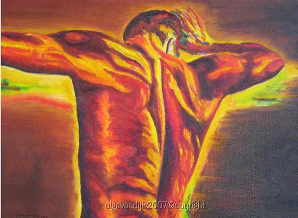
With this oil I tried to work with fiery colors to express a mood, but also the power and strength of trained muscles.
I used just a little bit of a complimentary color (blue/green in his hand) to give the red tones an extra enhancement!
Result: a conjugation of complimentary colors of this expressionistic torso!
Some info about choice of colors:
The complementary color scheme is made of two colors that opposite each other on the color wheel. This scheme looks best when you put a warm color against a cool color, for example, red versus green-blue. As you can see the complementary scheme is intrinsically high-contrast.
It is important just to use this complementary color for accents.
Special thanks to LOREDANA -one of our most accomplished photographers of ArtWanted!
Love and Light~OLGA
Abstract oil
Dimensions: 20'x16' (50x40 cm)
on a Studio stretched canvas.
Painted staple free sides.
Painting doesn't need a frame.
Copyright Olga
van Dijk
2007
Unauthorized copying or use of images is prohibited.
All rights reserved.
This is another
OlgArtsProduction©2007
5 of 108 Comments Show All 108 Comments
Sigridur Bachmann 18 Sep 2011
Such a magnificent work, great colors and light !Gina Cowins 20 Jul 2010
Hello Olga, you did accomplish your goal. There is energy, strength and emotions in this painting, congrats.Ossian 18 Jan 2010
Great work!!!Yuri Yudaev 26 Nov 2009
wow! electric power of human bodyMarika Antal 17 Nov 2009
most powerful art work wow!!